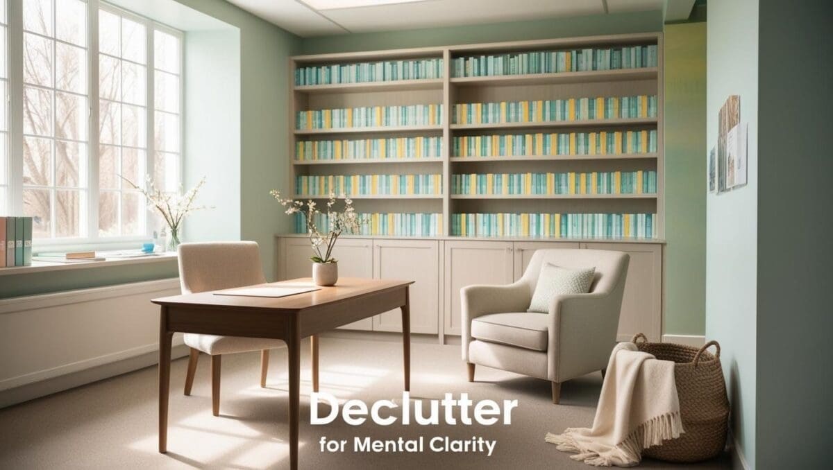
The Power of Color in Therapy Office Design
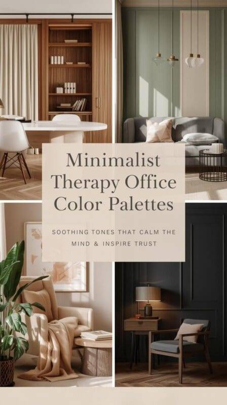
When a client steps into your therapy office, their nervous system reads the room before they hear a word. Light filters through linen curtains, landing softly on a cream wall. A walnut side table holds a single tumbler of pencils; a blush throw rests over a sand-beige chair. Nothing shouts. Nothing glares. The palette whispers, you’re safe here.
Color is more than decoration—it’s communication. Warm whites can loosen a jaw you’ve never noticed you were clenching; a muddy gray can make even a great chair feel cold. In a clinical space where nuance matters, palette sets the emotional tempo: steady, kind, grounded.
This guide blends color psychology, minimalist design, and therapeutic intention so you can choose a palette that co-regulates on sight. We’ll pair hues with light and texture, consider different client populations, and give you practical, trauma-informed tips—plus ready-to-test color ideas you can sample this week.
Why Color Matters in the Therapy Room
Environmental psychology is clear: surroundings affect physiology. In therapy spaces, that impact is amplified because clients arrive with heightened interoception and vigilant nervous systems.
- Soft, warm families (creams, taupes, gentle woods) support the parasympathetic “rest and digest” response.
- Harsh contrasts & saturated brights demand attention and can raise arousal—great for retail, not for regulation.
- Predictability and cohesion (a restrained palette with repeated materials) signal safety to the brain; clients don’t have to scan for surprises.
Trauma-informed design adds three principles:
- Low sensory load: avoid visual clutter and high-gloss finishes that create glare.
- Consistency: maintain similar values (lightness/darkness) across large surfaces.
- Gentle contrast: create orientation without sharp visual jumps.
Counselor insight: Color isn’t trend; it’s co-regulation. Choose hues that breathe with the steadiness you hope clients will feel.
1. The Psychology of Color in Therapy Offices
Palette 1: Warm & Cozy Neutrals—The Regulating Base
Picture This
Late afternoon sun warms a linen chair against a cream wall. A pale-clay rug grounds the room; a light walnut frame repeats the tone of a slim console. The air looks soft.
Why It Works
Warm off-whites and beiges carry low chroma (little saturation) and medium-light value. That combo reduces cognitive load while keeping the space from feeling clinical. Clients with anxiety or sensory sensitivity often settle faster in warm neutrals.
Design Tips
- Walls & ceiling: Warm Off-White (#F5F3EF) or Ivory (#F7F5F2).
- Large textiles: Warm Taupe (#CBB8A9), Soft Caramel Beige (#D6B89C).
- Wood tones: Natural oak or light walnut to add visual temperature without orange cast.
- Lighting pair: fabric-shaded 2700–3000K bulbs for evening calm.
Therapist Reflection
Warm neutrals are “background trust.” They make your micro-expressions, not your walls, the brightest thing in the room.
Optional test pots (brand agnostic cues)
Try sample equivalents of: “Swiss Coffee,” “Classic Gray,” “Natural Linen.”
Swatch Set
Natural Wood Brown #A38B78
Warm Off-White #F5F3EF
Soft Beige #E3D5C9
Light Taupe #B8A89A
Pale Clay #E2D1C3
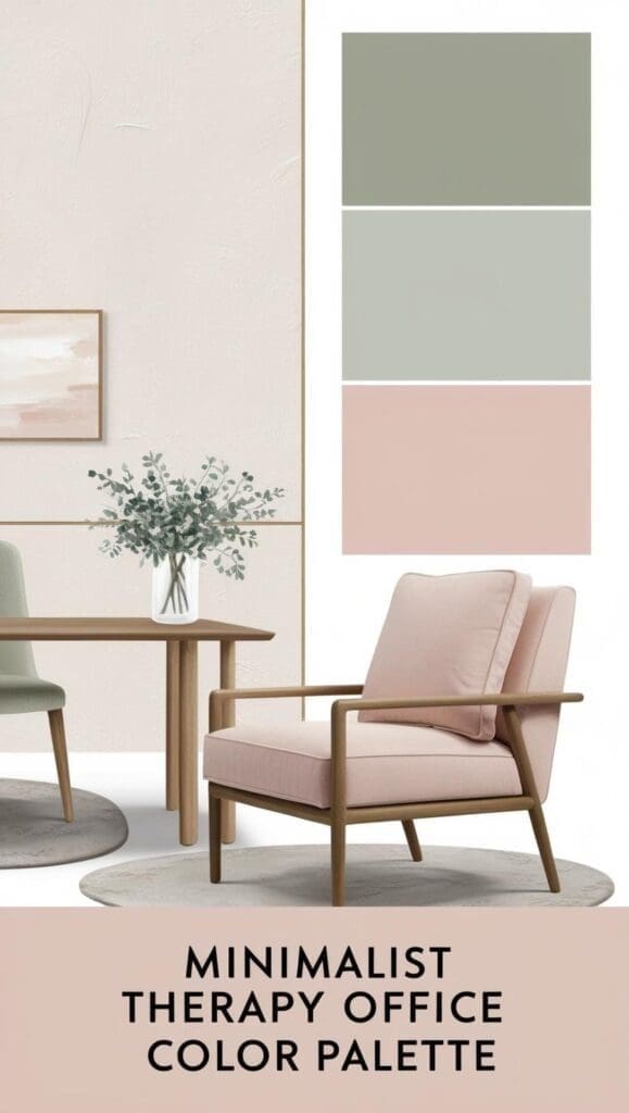
🎨 Minimalist Therapy Office Color Palette:
- Warm White (#F5F3EF)
- Soft Beige (#E3D5C9)
- Muted Sage (#A8B5A2)
- Blush Pink (#E8C3BA)
- Light Taupe (#B8A89A)
Palette 2: Soft Earthy Tones—Nature, Indoors
Picture This
A single sage wall meets a cream room; terracotta planter echoes a clay lumbar pillow. A vase in sand beige sits on the shelf like a small exhale.
Why It Works
Sage, terracotta, clay reference nature—grounding through biophilic cues. Greens support attentional recovery; muted clay warms the field without visual noise.
Design Tips
- Accent wall (only if the room gets good daylight): Muted Sage (#A8B5A2).
- Textiles: Terracotta Blush (#D9A18B), Clay Brown (#C2977D) for pillows/throws.
- Decor: stoneware, matte ceramics, woven seagrass.
- Plants: Peace lily, ZZ plant, or faux botanical if maintenance is an issue.
Therapist Reflection
Earth tones invite presence. I reach for them with clients who dissociate—they anchor the eye and help the here-and-now feel tangible.
Swatch Set
Deep Olive #7C8B74
Muted Sage #A8B5A2
Terracotta Blush #D9A18B
Clay Brown #C2977D
Warm Sand Beige #E4CDB2
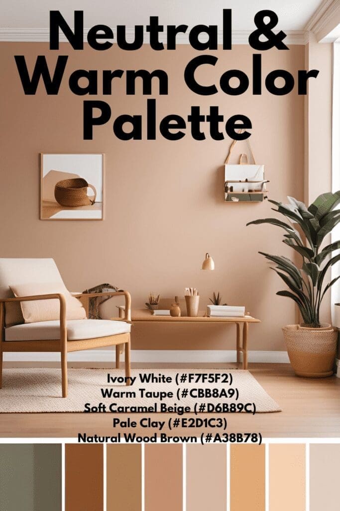
🎨 Neutral & Warm Color Palette:
- Ivory White (#F7F5F2)
- Warm Taupe (#CBB8A9)
- Soft Caramel Beige (#D6B89C)
- Pale Clay (#E2D1C3)
- Natural Wood Brown (#A38B78)
Palette 3: Blush & Pastel Tones—Compassion & Softness
Picture This
A cream sofa, a blush linen throw, and a pale nude wall that reads like candlelight at noon. Above, an abstract print whispers rose and lavender gray.
Why It Works
Blush and dusty pastels (low-saturation pinks/peaches) cue warmth, care, and approachability without childlike candy tones. They soften edges and can humanize modern furniture.
Design Tips
- Where to use: textiles, art, and very light wall tints.
- Color guardrails: keep pinks dusty (add gray) to avoid “nursery.”
- Pairing: mix with stone, linen, and oak to stay minimalist.
- Lighting: blush deepens under warm bulbs; sample first.
Therapist Reflection
A hint of blush can make disclosures feel less stark—compassion, in color form.
Swatch Set
Pale Nude Beige #F6E4DB
Dusty Rose #E8C3BA
Muted Peach-Beige #F3D5C0
Soft Lavender Gray #D1C2D1
Warm Blush Pink #F2B8A2
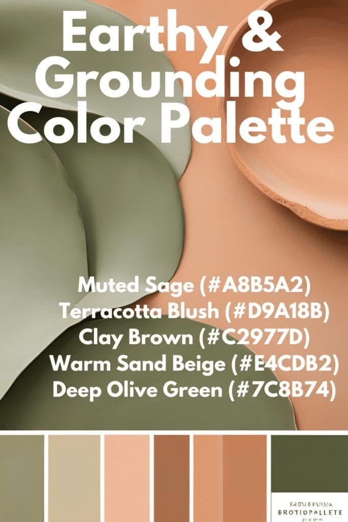
🎨 Earthy & Grounding Color Palette:
- Muted Sage (#A8B5A2)
- Terracotta Blush (#D9A18B)
- Clay Brown (#C2977D)
- Warm Sand Beige (#E4CDB2)
- Deep Olive Green (#7C8B74)
Quick Reference: Color & Emotion Pairings for Therapists
| Emotional Aim | Color Family | Best Use |
|---|---|---|
| Calm & Safety | Warm whites, taupes | Walls, large rugs |
| Grounding | Sage, terracotta, clay | Accent wall, pillows |
| Hope & Compassion | Blush, dusty peach | Art, throws, cushions |
| Clarity & Focus | Soft grays, dusty blues | Bookcases, desk surfaces |
| Balance | Wood + neutrals mix | Frames, side tables |
Pairing principle: Choose one base (warm white or beige), one grounding (sage/terracotta), and one softener (blush). Repeat those three tones across surfaces for cohesion.
Lighting & Texture: Completing the Minimalist Palette
Color only behaves well under the right light.
- Cool light (4000K+) makes colors read grayer; warm light (2700–3000K) enriches creams and blushes.
- Use fabric shades and diffusers to soften hotspots and reduce glare (glare raises arousal).
- Layer texture: linen drapes, wool rugs, boucle pillows, woven baskets. A cream wall becomes dimensional when paired with tactile materials.
Pro move: Photograph corners morning/noon/evening before committing. Your 10 a.m. cream can go lemon under late sun—better to learn on a swatch than a wall.
Designing for Different Client Populations
Children
Keep the base neutral; add small, soothing pops (pastel art, nature prints, soft green cubes). Avoid overtly themed walls that can overstimulate.
Teens
Modern neutrals with sage, clay, or charcoal accents. Use matte finishes and avoid glossy posters that glare.
Adults with trauma
Low contrast, gentle gradients, and consistent values. Skip stark black-white combos and high-gloss surfaces.
Couples / family therapy
Balance warmth and coolness—e.g., warm walls, soft gray storage, mixed wood frames—to avoid one person feeling “too cozy” while another seeks clarity.
Therapist’s Color Palette Planner (Mini Toolkit)
- Observe natural light AM vs. PM (and in winter).
- Limit to one base + two accents; repeat them intentionally.
- Sample behind the therapy chair and across from the main seat.
- Photograph test spots at three times of day.
- Choose low-VOC paint for health and sensory safety.
- Plan cordless/rechargeable lamps where outlets are limited.
- Keep a swatch ring (paint chips, fabric, wood) in your bag for on-the-spot decisions.
FAQs
How can I make a rented office feel cohesive without repainting?
Lean on large textiles: an oversized neutral rug, linen curtains on tension rods, and a calm art triptych. Add a slipcover to mismatched seating; repeat one wood tone.
What colors should I avoid in trauma-informed spaces?
High-saturation brights (red/orange), stark black-white contrast, and high-gloss finishes. They increase arousal and visual noise.
How do I balance my taste with client comfort?
Express personality in small, swappable accents (throws, prints) while keeping walls and big textiles regulated and quiet.
Does color affect the therapist too?
Yes. Long hours under cool grays can drain mood. Warm whites with soft woods often help sustain attunement.
Can I mix minimalist with cozy/feminine styles?
Absolutely. Minimalist is restraint, not austerity. Blend warm neutrals with blush textiles and natural wood; keep the palette tight.
Sample Minimalist Palettes to Test This Week
Balanced Minimal Therapy Mix
- Warm Off-White #F5F3EF (walls)
- Soft Beige-Gray #D9D1C8 (rug/curtains)
- Sage Accent #A8B5A2 (pillow/planter)
- Blush Dusty Rose #E8B9A4 (throw/art)
- Light Walnut (frames/table)
Earth-Calm Studio
- Ivory #F7F5F2 (walls)
- Warm Sand #E4CDB2 (rug)
- Terracotta Blush #D9A18B (poufs)
- Deep Olive #7C8B74 (vase)
- Natural Oak (shelving)
Quiet Compassion
- Pale Nude #F6E4DB (feature wall tint)
- Cream #F5F3EF (others)
- Soft Lavender Gray #D1C2D1 (art)
- Taupe #CBB8A9 (curtains)
- Brushed Brass (lamp base)
Affiliate-friendly ideas to explore: low-VOC paint sample pots; cordless fabric-shade lamps (2700–3000K); linen curtain panels; wool or washable rugs; framed abstract prints in muted palettes; upholstery swatches in performance linen.
Final Thoughts: Color as Co-Regulation
Your office is a quiet teacher. Every hue tells a story about safety, presence, and how gently change can happen. Choose colors that lower the volume on the room so the work can rise. Test in real light. Sit in each chair. Notice your breath.
When the lamp glows softly at dusk and a client says, “It feels warm in here,” you’ll know: your palette is part of the healing team. healing space that supports emotional well-being. Whether you choose warm neutrals, earthy tones, soft pastels, or a blend of them all, your color choices will create an environment that enhances comfort, trust, and relaxation for every client who walks through the door.
About the Author
Hi, I’m Eve, a former school counselor with a master’s degree in School Psychology and a passionate advocate for children and families navigating sensory challenges. As a mom of children with sensory sensitivities, I deeply understand the journey special-needs parents face, and I dedicate myself to researching and sharing practical solutions to help children thrive and feel comfortable in their bodies. My goal is also to empower counselors, therapists, and psychologists with creative strategies and supportive resources to enrich their everyday practice. When I’m not writing or exploring new therapeutic approaches, you’ll find me spending quality time with my family and continually seeking inspiration from everyday moments.

